
Is your website suffering from poor navigation? How can you tell if it is? Maybe the nav menu is hard to read, or the menu items are confusing. Perhaps it’s missing altogether (yikes). In this post, I’ll help you diagnose potential website menu problems and help you design better navigation for your website.
What’s the big deal about your website navigation menu?
You may have put a ton of effort into your main page or landing page. But that page may not be the first one visitors see. If they arrive at your site from a Google search, they may find a blog post, your About page, or a random product. And after they’ve perused that info, they’ll hopefully be curious to learn more. And when that happens (yay!) they’ll need a good map.
Most websites have some kind of menu or nav bar at the top. People expect to see that — it’s part of our internet muscle memory. Particularly for small business or restaurant websites, it should be as easy as possible for people to find what they need. If it’s confusing, you could lose potential customers to another business that does make it easy.
How do you know if you have a problem? Start by asking yourself a couple of good questions.
Is your website navigation menu even visible?
Imagine that you’re searching online for college application assistance for your child. In the first website you click on, the menu is hard to see.

The menu items are in a light, faded blue on a light background with a light-colored photo underneath. Not only is it hard to read, it looks unprofessional.
Then you try a different site from your search list and the menu is crystal clear.

Not only are the menu items bright white on black background, and it’s easy to find what you need at a glance. It looks like a much more professional site.
On the internet, people do judge books by covers. If your website looks unprofessional, people tend to assume your products or services are also unprofessional.
Too many menu items?
Another issue that can make it difficult for visitors to find what they need is having too many items in your nav menu. When people search the internet for a solution, they are in scanning mode. They’re looking for the first thing that leaps out and says:
- This is easy
- It’s what I’m looking for — or just interesting
- It’s professional
- I just like the design
It’s easy for people in scanning mode to get overwhelmed with choices. The more complicated things look when they reach your site, the greater the chance they will click away. Unless they absolutely have to use your site — government services come to mind — they won’t waste time if they get overwhelmed. And like I’ve said before, your website should be designed for your visitors, not for you.
I’ve given you a couple examples of poor website page navigation. Now let’s get into how to make your nav menu keep visitors on your site.
How to improve the navigation for your website
The following suggestions may seem simple — perhaps even boring. But little things can do wonders for converting internet scanners into customers.
Typeface and Font size
You might use a funky typeface in different areas of your small business site to jazz it up. And that’s okay as long as it’s legible and looks professional — which is subjective and a much deeper dive than we’ll get into here. However, funky, decorative typefaces don’t work well in your menu.


The size and spacing of your nav menu is also important. If menu items are too crowded, they’ll be as hard to decipher as a crazy typeface. And while font size is somewhat subjective, a good rule of thumb is to use a font size at 12 pts minimum. Don’t make them squint!
Like wayfinding signs in an airport, your site’s menu needs to be easy to understand.
Color
Remember the two examples I shared earlier? The second example is the most optimal. But that doesn’t mean you have to go with black and white. The important thing is the contrast between the type and the background. The menu items should stand out as much as possible.
If you use WordPress, you will actually get a little popup alert if you design a website element that may be difficult for visitors to see.
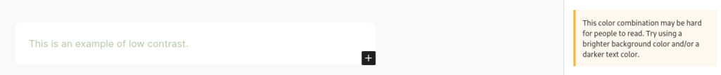

A high-contrast nav menu is not only more pleasing and easier to scan, it’s also important for your site’s accessibility.
Specificity and SEO
Another aspect of designing a great website navigation menu is your choice of words. The words you use in your navigation items should be descriptive, short, and on-brand. This is your chance to stand out a little from competitor websites.
For example, let’s say you have a donut shop where customers can browse your menu and order online for pickup. You could go with typical menu items like:
Menu | Order | Contact | About
Nothing wrong with that, but you could get more specific. Instead, try:
Our Donuts | Order Donuts | Reach Out | We Love Donuts
That specificity accomplishes three things:
- There’s no question what your website is about
- It’s simply more interesting
- It’s better for SEO
There are many more nuances to SEO than putting keywords in a menu, but a menu that reads wth the actual name of your product will help your site rank better in Google searches than an ordinary, generic menu.
Designing a website menu for mobile
When designing any website these days, it’s absolutely necessary to have both desktop and mobile in mind. On average, 60–64% of people first browse a website on a mobile device. That means your navigation must be mobile-ready. And that means hamburgers.
You’ve likely seen what’s called a “hamburger menu” when visiting a site on your phone or tablet. That’s those three little lines at the top of a site. To me it looks more like a Monte Cristo sandwich, but let’s stick with the internet vernacular for now.

Condensing the nav menu like that makes the rest of your site easier to view on a small screen. It’s essential. If you’re reading this on a desktop screen, you can try it with this site:
- Shrink your browser window until the hamburger menu appears.
- Click the three lines at the top right of the page (you may have to scroll up).
- The menu items will pop out. Yay!
Thankfully, when designing on platforms like WordPress, Squarepace, Shopify, or Wix, the mobile menu happens automatically. But if you have someone designing a site for you from scratch, make sure they include that hamburger menu adjustment for small screens. If you’re designing it yourself, it’s pretty easy to do with CSS: W3 Schools How To Create a Mobile Menu.
Better navigation for your website is pretty easy
It’s not difficult to implement the tips I’ve given you here, but it makes a world of difference for your visitors.
If you want to find out more easy things you can do to improve your website, you can get your free guide right now.
Leave a Reply